Storytelling with data: lessons from a motley team
15 April 2019
The Takeaway
Data science helps us find useful answers to pressing questions but effective communications is critically important in delivering insights to the public. In particular, effective storytelling and graphic design is a crucial precondition for the ignition of systemic change. Undertaking such a project requires a multi-disciplinary approach.
Introduction
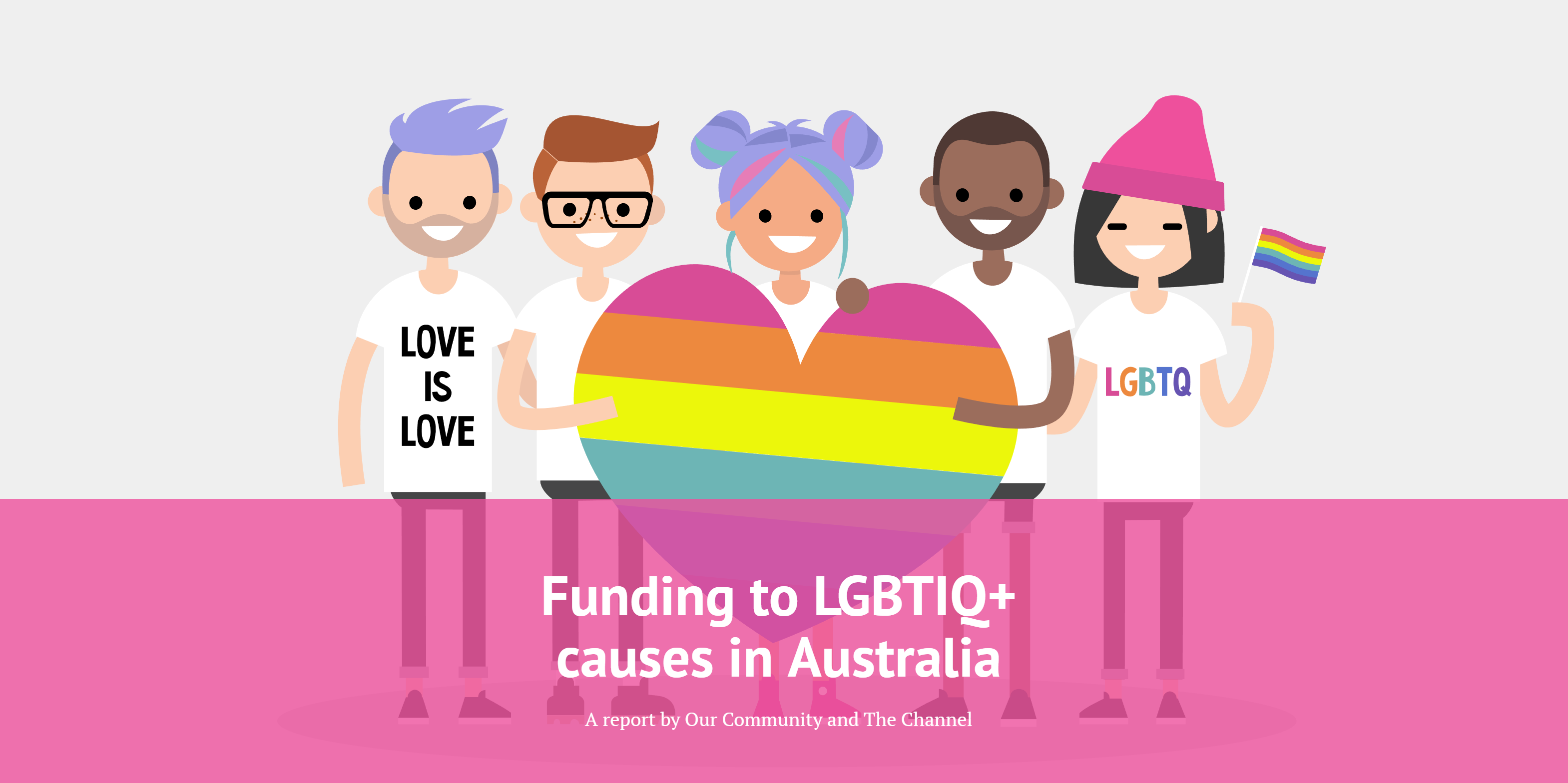
The Our Community Innovation Lab wrapped up its first project in April 2019. In partnership with The Channel, we completed an analysis of funding trends in relation to LGBTIQ+ organisations and causes, and presented our findings in an interactive, visual scroller.
The project was the first of its kind for the team. It involved elements of data analytics, data storytelling, graphic design and data visualisation, to name a few of the disciplines that we called into play.
We found that LGBTIQ+ organisations and causes in Australia are getting a very small proportion of the total funding in Australia. While individual giving to LGBTIQ+ causes is increasing year on year, funders (government, corporate and philanthropic) are failing to target LGBTIQ+ projects. We found that the majority of grant rounds received only one application from an LGBTIQ+ group or project.
Just as importantly, our team discovered a lot about running a project focused on data and storytelling, knowledge we will use to good effect in future OC House projects.
While the findings of the project are being explained and disseminated by our data partner, The Channel, this article seeks to explain how we went about conceiving of, undertaking and concluding the project.
The background
In mid 2018, the Our Community Innovation Lab sought expressions of interest from not-for-profit organisations who might be interested in partnering with us on a data project. This was to be the first project led by Our Community's team of data and communications specialists..
The purpose of the project was to develop our skills in collaborating with a not-for-profit organisation, and kick-start our mission to help bring the Australian not-for-profit sector into the data era. We were also eager to give a not-for-profit organisation access to the data science and communications skills within the team.
We received around a dozen expressions of interest and chose The Channel, Australia's first LGBTIQ+ giving circle, whose mission is to increase funding to LGBTIQ+ organisations and causes. The organisation wanted to work out whether the rainbow community was being underfunded and, if so, to what extent.
The principles
Whilst this was the first project of its type for the Innovation Lab, the team had some guiding principles that had been established at its inception.
Firstly, the project had to be useful, not just interesting. We continued to ask, from start to finish, "What should people do with this new information?" For The Channel, a clear, quantified overview of the LGBTIQ+ funding landscape in Australia was clearly useful to help justify funding gaps.
Secondly, we had to make it easier, not harder, for people to digest the mountains of information we had available. We wanted to create something more digestible than a typical report.
There are other principles that underpin the work of Innovation Lab, but as we started, these were the two at the forefront of our minds.
The process
Our director of data intelligence, Sarah Barker, initiated the project, running the selection process with input from our data scientists, and getting the partnership agreement in place with executive director of The Channel, Georgia Mathews. The agreement covered data protection, ensuring appropriate data security and data handling measures.
Our data scientist, mathematician Joost van der Linden, investigated data from Our Community's Funding Centre, GiveNow and SmartyGrants platforms, as well as external sources such as Foundation Maps Australia and the Australian Charities and Not-for-profits Commission (ACNC). While linking these datasets together was particularly challenging, when taken together, a reasonable representation of the funding landscape emerged. Each dataset presented unique data preparation challenges (such as the unreliable LGBT tag in ACNC annual statements). Joost made use of a range of automated tools to properly identify LGBTIQ+ charities, causes and projects in each dataset, and employed some rigorous manual validation to ensure the final results were accurate. Once the data had been properly cleaned, trends and group comparisons were able to be made.
It was then time to bring in the subject matter experts (The Channel) to participate in a collaborative workshop and help us digest the data through a rainbow lens. Georgia and the Channel team provided the necessary context, and together we began to formulate a storyline that was not just interesting, but would prove to be useful in creating change.
Next our communications advisers, Kathy Richardson and Alex McMillan, took the ideas and critical points raised during the workshop and began to tease out a storyline that would help contextualise and enhance the data. The story was workshopped a few times, with input from The Channel, before we settled on a narrative.
The project then moved into the hands of our designer and front-end web developer, Amy Johannsohn, to translate the story into some stunning animated visuals, and then style and build the responsive website. Amy utlilised animated and static images to highlight key insights, along with HTML and CSS to build the website. Our data scientist Joost Van der Linden then fed in some JavaScript for the interactive graphs.
This multi-disciplinary, cross-organisational team provided feedback to one another at every step of the process, ensuring that collaboration formed the foundation of our work methods. It was resource-intensive but fruitful and highly rewarding. The success we had with the storytelling workshop format illustrates how important it is to convert raw data-driven insights to a useful story with the help of subject-matter experts and cross-functional collaboration.
The output
The end product is a colourful interactive scroller, a tool that allows us to convey a vast amount of complex data without overwhelming the audience (thus fulfilling another of the Innovation Lab's values - "to scale it must appear simple"). The tool is embedded in a webpage, making it very easy to share.
The scroller contains data that is new to the not-for-profit sector and the rainbow community, adding to our collective understanding of funding patterns, and systemic barriers.
It also provides a talking piece for The Channel helping to fulfil its aim of increasing funding for rainbow causes by encouraging the individuals and organisations who view it to take action.
As a side benefit of the project, the team developed a reusable system for uncovering funding trends for particular causes and beneficiary groups (funding for men's sheds, for example; or funding designed to alleviate violence against women), a tool that can be repurposed for future projects and other purposes.
The lessons
Data science helps us find useful answers but effective communications (storytelling; graphic design) is critically important in delivering data to the public in a digestible fashion - which is a crucial precondition for the ignition of systemic change.
Because of our unique, birds-eye view of the funding landscape in Australia, we don't need data from a not-for-profit to run a data project in partnership with them. There are countless sources of data that we can tap into in order to find the answers we seek.
The data doesn't always tell you what you think it will; instead, it has the tendency to bust myths and/or take you down unexpected paths. This is both frustrating and liberating, as you must learn to accurately interpret the data, question and re-cut the numbers when they "smell wrong," and reshape your assumptions if they are found wanting. Keeping an open mind is key. While you may have posed what seemed like a simple question at the outset, you need to get comfortable (quickly) with not always being able to find a simple, definitive answer.
Like any creative endeavour, running a data communications process involves hard work and takes time. In particular, when dealing with information about vulnerable communities, a thoughtful approach and design is key. We are learning that we need to borrow from the wisdom of the medical profession when they say, "First, do no harm."
Finally, we learned that while there are new ways of communicating that are effective and exciting to participate in, getting together in person to hash out your ideas is just as important and can be just as fun.
MORE
About the data project | About Our Community’s Innovation Lab
For info about The Channel’s plans to grow LGBTQI+ philanthropy, email: info@the-channel.org
Visit them at: the-channel.org | Twitter | Facebook